Interaction Design

Redesign an existing app
Improve and reimagine the UX
Create a hi-fidelity prototype
BRIEF

PROCESS
The entertainment.ie app shows cinema listings, film reviews, trailers, news and schedules for all cinemas in Ireland.
Primary research identified several problems with this app ensuring plenty of scope to improve and add value to the current user experience.
Some of the issues:

No search function
Can’t book tickets

Map non-interactive
Cinema name not displayed

Lists are non-alphabetical
‘Favourites’ is difficult to see
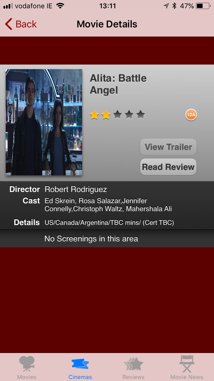
Images are distorted
Inactive trailer button on every screen
‘No screenings in this area’ on every screen


Inconsistent star ratings…is it 3.5 or 4 stars?
Context Review Research
Research was carried out on a broad range of applications containing some of the functions we were trying to emulate.


Netflix illustrated how it would look to utilise a contrasting interface for kids programmes.
Netflix


Citymapper has a pleasing and fully functioning interactive map, while Pinterest uses a simple yet intuitive search field.
Citymapper


Moleskine’s Timepage app contains lists and colourways both appealing and relevant, while Trivago was useful to explore as an aggregator product.
Timepage
Trivago

This project from a Dribbble portfolio contained an exciting and relevant colour palette.
Dribbble
Visual Design
A design system library was created, with design patterns, such as colors, text styles, assets and components to build a quality consistent prototype.

Colour palette
Typography
Gibson is the font used.


UI Elements

Image Styles


Layout
Iterative Design Process

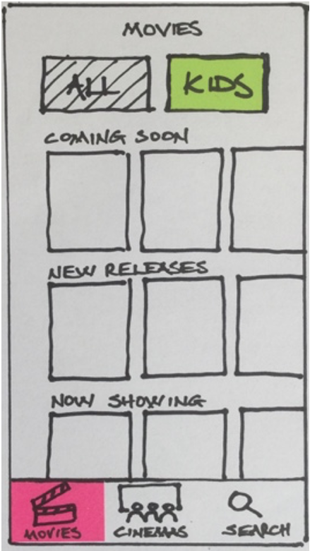
Crazy 8s
Ideation through crazy eights and subsequent sketches provided the core of the design.
Balsamiq was used to create a wireframe prototype, which was tested and iterated before progressing to a hi-fidelity prototype created in Adobe XD.
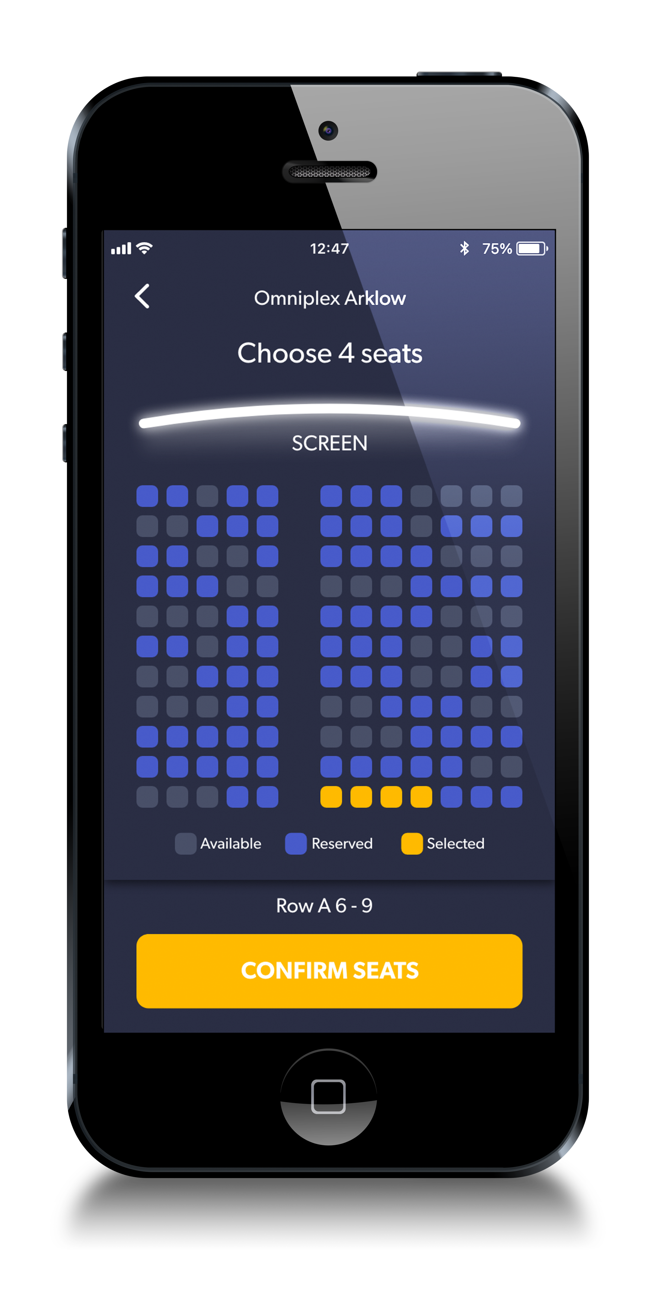
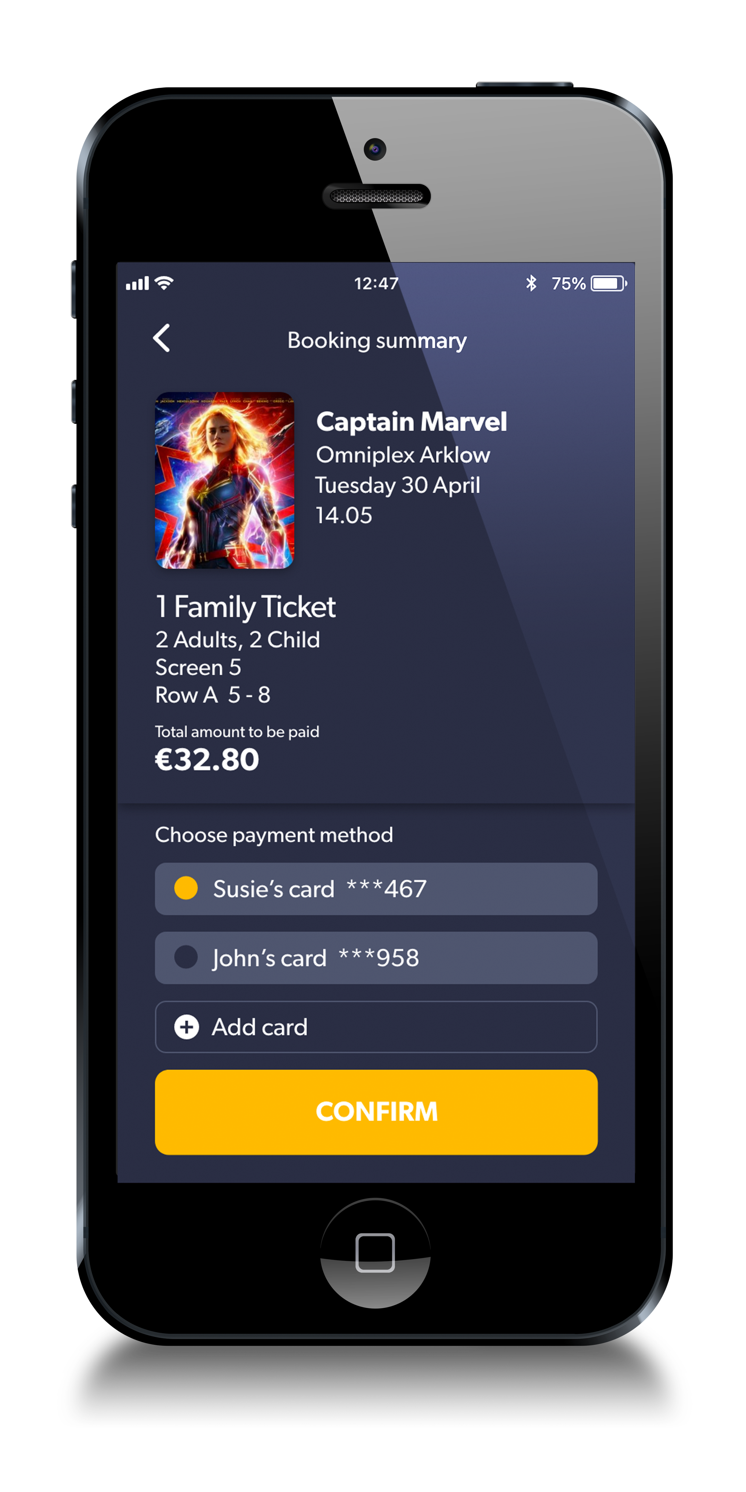
Development of screens for ‘All’ and ‘Kids’ movies


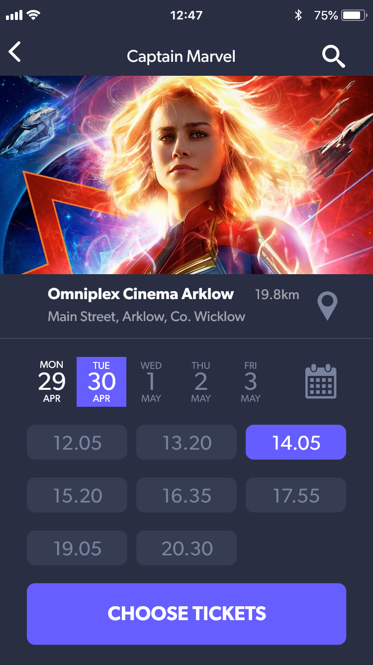
Movie times and dates


Cinema listings


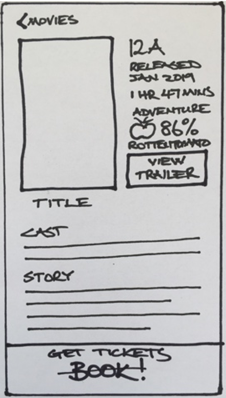
Movie details & trailers


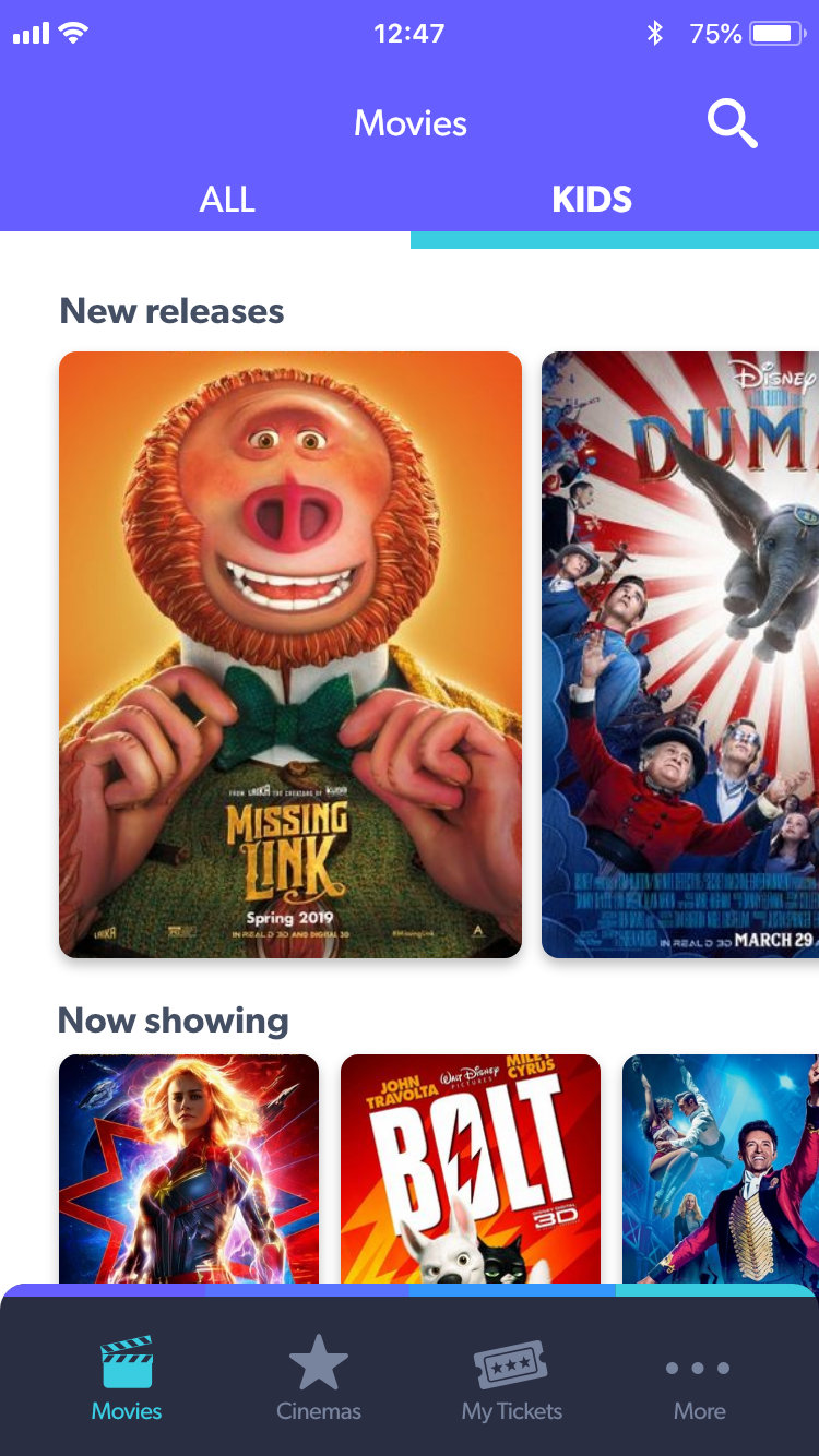

From original app to hi-fidelity prototype

DELIVERED
XD Prototype
The wording used in the prototype is designed for clear communication and is very simple to understand e.g. All, Kids, Story, Choose tickets, Book tickets.
Visual consistency exists throughout, with the use of a common layout grid, button styles, typography and a colour palette. A tab bar appears on most screens and is a pattern to provide clear navigation. Other patterns include list formats and CTA buttons.
The prototype follows conventional standards in terms of interactive target areas, placement of interactive elements and common gestures.
There is a clear and efficient journey from launch to receiving a digital ticket.